


Mathematical Insights on COVID-19 Spread and Risks
COVID-19: A Global and Mathematical Perspective
Richard R. Zito, Ph.D1
- Richard R. Zito Research LLC; Tucson, Arizona, USA
OPEN ACCESS
PUBLISHED:28 February 2026
CITATION: Zito, R.R., 2026. COVID-19: A Global and Mathematical Perspective. Medical Research Archives, [online] 14(2).
COPYRIGHT: © 2026 European Society of Medicine. This is an open-access article distributed under the terms of the Creative Commons Attribution License, which permits unrestricted use, distribution, and reproduction in any medium, provided the original author and source are credited.
ISSN 2375-1924
ABSTRACT
This publication describes the global spread of COVID-19 in mathematical terms from its beginning in Wuhan, China. Using the techniques of graph theory and matrix algebra, the airports servicing Seoul and London are identified as most in need of passenger screening to prevent the global spread of infectious disease by air travelers during a pandemic. Furthermore, it is the trace of powers of the adjacency matrix which is the matrix that characterizes the network of flights connecting cities on a regional or global scale that is proportional to the infection risk of any given network of flights. It will be demonstrated that relatively small network changes can result in a significant reduction of infection risk, with a minimal reduction of passenger throughput. The infection risk posed by population migration is more difficult to characterize than that posed by air travel, although the two are related. However, chaos theory suggests that once the infectiousness of a disease (as measured by the reproduction number, the number of people that each sick person can infect in a fully susceptible population) exceeds a threshold of about 4, the future number of active cases becomes difficult to predict; a phenomenon that is exacerbated by extreme sensitivity to initial conditions. That is to say, individual cases can make large changes in the future course of a pandemic, making accurate long-term prediction impossible.
Keywords: COVID-19, air travel, migration, adjacency matrix, chaos theory.
Introduction
In many ways the COVID-19 pandemic is unique in the annals of medicine. COVID is one of the most infectious diseases known measles, the most infectious disease known, is slightly worse. This, combined with rapid inexpensive intercontinental air travel and global mass migrations, produced unprecedented conditions ideal for the spread of disease. As COVID spread, science watched, and never before has there been so much data available to biochemists, molecular biologists, geneticists, physicians, and mathematicians, from the very beginning of its onset. This publication will concentrate on the mathematics of that spread. Graph theory and matrix algebra will be used to identify global hot spots requiring monitoring for the early detection of infectious diseases. Furthermore, the chaotic behavior of recursive equations and systems of nonlinear differential equations seems to explain some of the quasi-erratic features of the COVID pandemic due to the uncontrolled migration of people; especially into Europe from Africa and the middle east, as well as across the southern border of the U.S. Unfortunately, this same chaotic behavior may also preclude accurate long-term predictions for the course of any pandemic in the same way that accurate long-term weather forecasting is forbidden.
The Beginning of the COVID-19 Pandemic
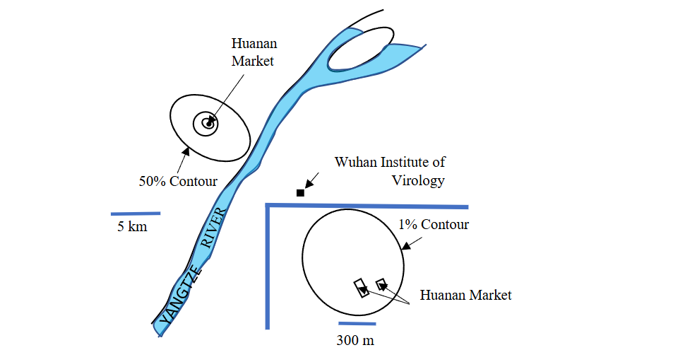
The COVID-19 pandemic began at the Huanan Seafood Market in Wuhan, China. Examination of Figure 1 explains why this conclusion is so certain. Notice how half of the first 155 infections (December 2019) were clustered around the Huanan Market, with only 19 infections (12.26%) observed on the other side of the Yangtze River where the Wuhan Institute of Virology was located. Although some have suspected the Institute as the source of the infection, the probabilities are greatly against this hypothesis since it wasn’t until February 2020 that 3 cases appeared near the Institute. By then Wuhan had experienced a total of hundreds of cases of COVID-19.
On December 26, 2019, Dr. Zhang Jixian of The Second Hospital of Hebei Medical University Shijiazhuang, China, a veteran of the 2003 SARS outbreak, observed in the CT thorax images of two elderly patients, differences from pneumonia caused by common viruses. Further examination of the couple’s son also showed the same abnormalities in the CT scan, as did another patient admitted on December 27 from the Huanan Seafood Market. Patient isolation measures began almost immediately. Although the identity of the true patient zero, the first person to have been infected in the COVID-19 pandemic in Wuhan, China, remains unconfirmed and the subject of debate, a study by Michael Worobey suggests it was a female seafood vendor at the Huanan Seafood Wholesale Market with symptom onset on December 11, 2019. In any case, the pandemic had certainly begun.
So, how did an infection that started at a seafood market in China spread over the entire planet and, as of April 13, 2024, infected 704,753,890 million people (confirmed cases), and killed just over 7 million globally? In a world of almost 8 billion people, that’s about 9% of the Earth’s population infected and 0.09% dead. The answer is basically AIR TRAVEL and MIGRATION!
The Trouble with Travel
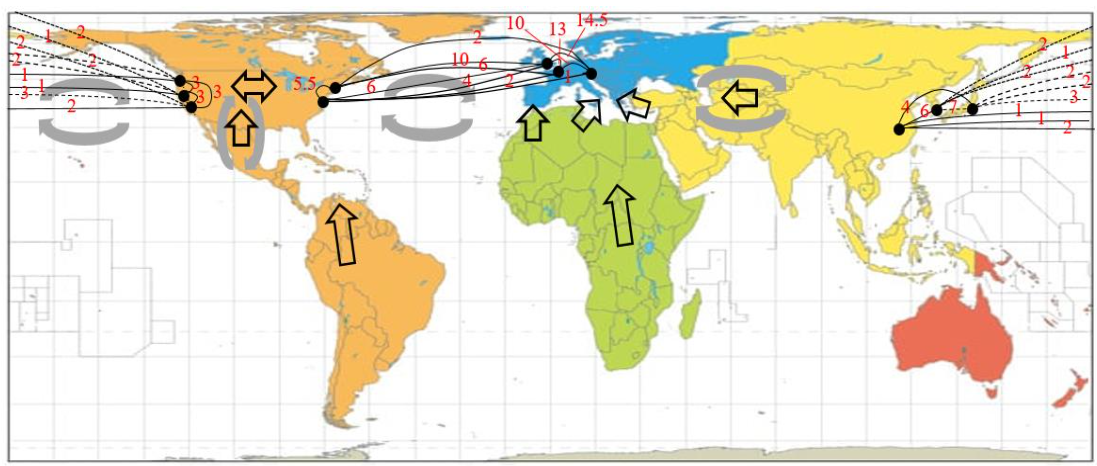
When people travel they take their diseases with them, and the United States- an economic power situated between the economic powers of Europe and Asia – bears a particularly heavy responsibility when it comes to preventing the global spread of disease in general. Figure 2 is a simplified map of the direct (non-stop) air routes (links) of several major airlines connecting the capital cities of the Pacific Rim and the North Atlantic with U.S. coastal ports of entry.
Tokyo Japan, Beijing China and Seoul South Korea were used to represent Asia. This is convenient because the major carriers Japan Air Lines (JAL), Air China (AC), and Korean Air (KA), respectively, have their hubs in these cities. Representing the U.S. is more difficult. It will be assumed that Seattle, San Francisco, and Los Angeles represent the most common points of entry into the U.S. from Asia because they are the closest major cities. Furthermore, the major carrier Delta Air Lines (Δ) will be used to represent the U.S. routes to Asia. Around the North Atlantic, Western Europe will be modeled by London UK, Paris France, and Munich Germany, which are hubs for British Airways (BA), Air France (AF), and Lufthansa (L). Again, representing the U.S. will be more difficult because of its size, but New York and Washington D.C. will be chosen as models for the East Coast. The proximity of these cities to Europe, and their importance, suggests that there will be a great deal of human traffic between these two American cities and the economic/industrial/tourism capitals of Europe. As before, Delta Airlines (Δ) will be used to represent air traffic from the U.S. to Europe.
The Carrier Flight Adjacency Matrix
The air routes in Figure 2 can be reduced to two simple graphs. One representing the Pacific Rim, and the other representing the North Atlantic (Figure 3). Ultimately, from each of these graphs, a mathematical object that will be called a total flight adjacency matrix will be constructed. However, it will be helpful if an intermediate matrix, that will be called a carrier flight adjacency matrix, is constructed first. The entries of the carrier flight adjacency matrix (Figures 4 and 5) are just the number of direct non-stop round-trip daily flights from the hubs of the carriers cited above to another air-adjacent city.
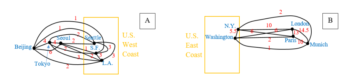
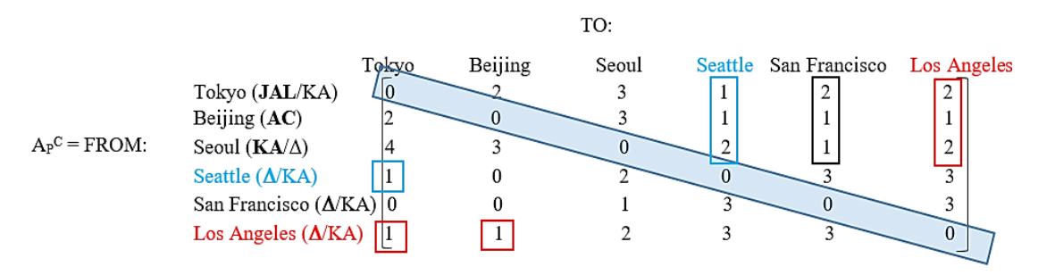
The carrier flight adjacency matrix of Figure 4 suggests that on the West Coast of the U.S., Los Angeles is the most dangerous city with regard to the introduction of infections from Asia. The reason is because it is connected by the largest number of flights to Asia (the sum of the numbers in the red boxes is 2 + 1 + 2 + 1 + 1 = 7 flights per day). Next comes Seattle, with a total number of flights (blue boxes) equal to 1 + 1 + 2 + 1 = 5 flights per day. Finally, San Francisco is safest with only 2 + 1 + 1 = 4 flights per day (black box). What actually happened was that Seattle was infected first, followed almost simultaneously by Los Angeles. A situation not unexpected given the size of the elements of APC.
There is very little public information available about U.S. patient zero because he understandably wishes to remain anonymous. Although patient zero was the first person in the U.S. positively recognized to have COVID-19, it might have been circulating unrecognized on the West Coast of the U.S. for a few weeks before that. What has been published is that patient zero was a 35-year old male, he checked himself into a clinic on January 19, just four days after arriving in Seattle on an indirect flight from Wuhan China. Seattle’s patient zero (synonymous with patient zero for the U.S.) was initially quarantined in an Ebola-type enclosure, but was eventually released when he was deemed to be non-infectious on February 21, 2020 (33 days after arrival at the clinic very safe). However, COVID continued to spread in the Seattle area. This suggests that one or more of patient zero’s contacts was missed, or that a second vector was introduced into the area! In Los Angeles county, patient zero was Qian Lang, a 38-year-old salesman whose wife’s mother lived in Wuhan, China. He was also U.S. patient 4, and was eventually hospitalized at Cedars-Sinai Medical Center after experiencing a severe fever on January 22, 2020. It should be noted that the travel-ban from China to the U.S. did not take effect until 5 PM EST on February 2, 2020. Furthermore, it would not have applied to either patient zero anyway since citizens and lawful permanent residents of the U.S. and their immediate relatives were exempt. In short, the travel ban was too late and too porous to prevent disease from entering the U.S.
Wuhan is not well connected by air, and arriving at a hub in time for a departing international flight to Seattle is problematic. However, one possible path that avoids excessive layovers but provides adequate aircraft transfer time might be something like flying China Eastern Airlines from Wuhan to Tokyo, followed by a JAL flight to Seattle departing at about 6:10 PM on January 15, 2020 and arriving in Seattle at about 9:55 AM, also on the 15th after crossing the International dateline. Perhaps patient zero had something to eat during his layover in Tokyo; assuming he really did travel that way? Perhaps he unknowingly infected others in that airport? Although, this seems unlikely since the flight from Tokyo to Seattle is about 9 hours, putting him in Tokyo about four and a half days before the onset of clinical symptoms. Therefore, patient zero was probably infected just before he left Wuhan, and would have had a very low virion titer. Without coughing or sneezing, transmission seems unlikely, although technically he would have been an incubation carrier. However, the infection of others after arriving in Seattle prior to hospitalization is likely much more likely than remaining infectious after quarantine, when his antibody titer was near maximum and he was no longer symptomatic. The travel scenario presented here is speculative, but it does match what matrix elements APC(1,4) + APC(4,1) = 2 suggest to be a high probability route for how COVID reached the West Coast of the U.S. Only travel to Los Angeles from Tokyo is riskier; APC(1,6) + APC(6,1) = 3. Something similar to this reconstruction of events may have actually taken place. The establishment of the Traveler-based Genomic Surveillance program in Seattle-Tacoma International Airport, LAX, and San Francisco International Airport, by the U.S. government will facilitate early detection of infectious diseases introduced into the West Coast of the U.S. from Asia. This recent very important step was taken far too late to have prevented the spread of the COVID-19 pandemic in the U.S., but it will be a vital link in the chain of infectious disease defenses going forward into the future. What about the circulation of disease in the other direction? How did the COVID infection reach the East Coast of the U.S.?
The Spread of COVID Across Eurasia
So, how did an infection that started out in Wuhan, China, manage to migrate across Eurasia to Kent, UK? The answer to this question comes from tracking numerous patient zero cases (Table 1). The trend is clear. COVID spread across Eurasia primarily through land and air travel into, and out of, China. Although some experts think that identifying patient zero individuals, for any particular region, is counterproductive, they are wrong! The chain of patient zero individuals is one of the clearest pieces of evidence available for the spread of disease. No one is blaming anyone else, and although the first clinically documented cases may not be the very first actual cases, they are certainly some of the earliest; thereby giving a pretty clear indication of the spread direction. Waiting until an infection spreads further can create a misleading impression of the time sequence of events. Just because one population has a lower number of cases per capita than another neighboring population does not necessarily mean that they are in an earlier stage of pandemic, and therefore the second to be infected. Differences in isolation (both personal and national), as well as climate, and the natural resistance of a population, all affect case counts in a complex way.
| Country | Patient Zero Biography | Date of Onset of Symptoms | Reference Number |
|---|---|---|---|
| China | Female worker in Huanan market | Dec. 11, 2019 | 3 |
| Nepal | 32-year old male and student in Wuhan | Jan. 3, 2020 | 25 |
| India | 3rd year medical student from Wuhan | Jan. 30, 2020 | 26 |
| Pakistan | 23-year old male | Feb. 26, 2020 | 27 |
| Iran | Unnamed merchant from Oom who traveled to China by air. | ~Feb. 19, 2020 | 28, 29 |
| Turkey | Male traveler to Europe! | Mar. 10, 2020 | 30 |
| Continental Europe: Spain | A pregnant female in Spain. | Mar. 4, 2020 | 31 |
| France | 42-year old male. Possibly the first case in continental Europe. Wife worked near airport. | Dec. 27, 2019 | 32 |
| Italy | 38-year old male from Codogno, Lombardy. | Feb. 21, 2020 | 33 |
| UK | No patient zero identified. Infections introduced on at least 1100 occasions, mostly from Spain, France, and Italy. | ¿Early Sept. 2020 for alpha strain? | 21, 34 |
The globe has now been spanned, and the spread of COVID within the U.S. has been discussed in detail in the literature. Although a carrier adjacency matrix may seem to be just a very convenient way of organizing data, it can be used to generate a more general type of adjacency matrix for all flights between any two cities, regardless of carrier. This total flight adjacency matrix has many desirable mathematical properties that allow the epidemiologist to answer certain types of questions relevant to the spread of disease. In fact, the total flight adjacency matrix is so useful that it would be a great help for detecting and managing the global spread of infectious diseases if it were expanded to include all the Earth’s cities, airline routes, flights, and the exact number of passengers on each flight. Extracting all the information available from such a large matrix is a job for a super-computer.
The Total Flight Adjacency Matrix
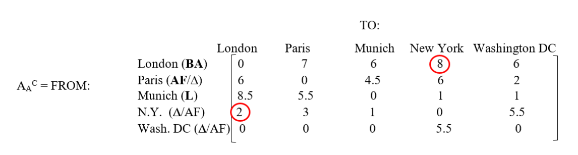
From the discussion above, and the caption to Figure 4, the elements of the total flight adjacency matrix (denoted by AP and AA for the Pacific Rim and North Atlantic respectively note that the superscript C has been removed) is constructed as follows. Let i and j be integers used to identify the row and column of any two hub cities, then the (i,j) element of the total flight adjacency matrix is just the sum of the (i,j) and (j,i) elements of the carrier flight adjacency matrix when the carriers based in the i and j hubs are independent. If the carriers based in the i and j hubs are partners, then the (i,j) element of the total flight adjacency matrix is equal to the larger of the (i,j) and (j,i), elements of the carrier flight adjacency matrix; these latter two elements are usually, but not always, equal to each other (e.g. see Figure 4 caption). Therefore, the (i,j) and (j,i) elements of the total flight adjacency matrix are also equal to each other (i.e. the total flight adjacency matrix is symmetric with respect to round-trips, or one-way legs as well). These simple rules prevent double counting of flights in the advent of alliances between airlines. Figure 6 shows the populated total flight adjacency matrices for the Pacific Rim and the North Atlantic.
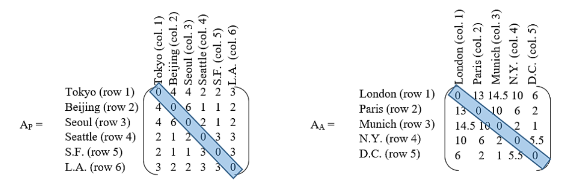
If all the flight bookkeeping has been done correctly, the total flight adjacency matrices will be square and symmetrical with respect to the main diagonal of zeros; a useful arithmetic check. Note that exactly the same matrices apply to one-way legs of each round trip as well. Notice also that elements AP(1,6) + AP(2,6) + AP(3,6) = 7, as they should (cf. Figure 4). That is to say, the number of direct, non-stop, round-trip flights from the three major Asian capitals into Los Angeles is 7 per day; as previously determined. Also, the most dangerous route into the U.S. from Asia is Tokyo to L.A.; element AP(1,6) = 3, as previously discussed. We are now ready to do some interesting calculations. Note that matrix elements may be any real number, but the results of calculations may be easier to understand if entries are rounded off to the nearest integer.
The Paths, Cycles, Circuits and Ways of Travel
When people travel between two cities, they may not take the same flights over and over again. Scheduling difficulties, or traveling at different times, may require taking different flights. Furthermore, tourists may deliberately wish to stop at as many cities as possible before reaching a given destination and returning home. A natural question to ask is, How many paths (direct or indirect) connect any two cities? In Figure 3, cities were marked by dots called vertices, while airline routes were denoted by lines called edges. Edges have numbers on them or next to them, indicating that that one edge should also be replaced by multiple edges, each representing a round-trip flight (i.e. two flights, one going and one coming). However, the numbering scheme has been used to simplify the graphs. Otherwise 10 edges would have to be drawn just to connect N.Y. to London in Figure 3B. What a mess! Now, the word path has to be defined more carefully. Mathematically, a path is just a sequence of edges (also called a walk in the literature). In general, a path may use an edge (flight connection) more than once, and a vertex (city) may be visited more than once also. A path in which an edge (flight connection) is used only once will be called a simple path (also called a simple chain or a simple edge sequence in the literature). In that case, once you board your departing flight, you are committed to finish your trip, and you can’t go back to get the medicine you may have forgotten! However, you may return to a hub city to depart to another city not yet visited (i.e. your journey may involve a loop a colloquial term). Recasting the last question more precisely in terms of these graph theory definitions yields, How many paths N-edges (N-flights) long connect any two given vertices (cities)? This is the question that must be answered because the more paths that connect any two cities, the greater will be the potential for the spread of disease. As an example, consider Figure 3A. How many paths connect Beijing to Seattle that are two legs (2 edges, N = 2) long? The answer may surprise the reader. There is a theorem in graph theory that says the number of such paths between any two vertices (cities) of a graph is given by the matrix elements (entries) of the matrix AN = A2 (i.e. A A, where the represents matrix multiplications as defined in mathematical handbooks, and where the symbol A without any subscripts has been used to represent either AP or AA). When two matrices are matrix multiplied together, the elements of row i of the first matrix are multiplied by the elements of column j of the second. The results of this arithmetic are then summed, and that sum is the value of the (i,j) element of the product. After a little work, all the elements of the product can be filled in. The result when A = AP is displayed in Figure 7.
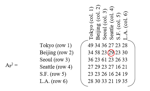
The element circled in red indicates that there are 29 paths from Beijing to Seattle if a traveler is willing to make one stop to change planes. This result may seem baffling, but counting the paths will convince the reader of its veracity. There are 4 paths (flights) from Beijing to Tokyo, and two paths from Tokyo to Seattle that makes 4×2 = 8 unique paths. There are 6 paths from Beijing to Seoul and two more paths from Seoul to Seattle that makes another 6×2 = 12 paths. There is only one path from Beijing to San Francisco, but there are three paths from San Francisco to Seattle so there are another three paths furnished by this sequence of flights. Finally, a traveler can go along two paths from Beijing to Los Angeles followed by another three paths to Seattle that yields another 2×3 = 6 paths. Therefore, all total, there are 8 + 12 + 3 + 6 = 29 distinct paths to get from Beijing to Seattle via one layover! Compare this to only one direct, non-stop, flight from Beijing to Seattle. The one-stop paths are more than an order of magnitude more common; and cheaper as well. U.S. patient zero used an indirect path. One should note that the main diagonal of the symmetrical matrix AP2 enumerates all possible round-trip cycles involving two legs; where a cycle is technically defined as any path that begins and ends at the same vertex (city). For example, Seoul has 61 such cycles that are two legs long, a maximum number for any of the cities considered. The reader may wonder how that can be, since Figure 3A shows only 6 direct, non-stop, round-trip daily flights connecting Seoul to Beijing, 4 to Tokyo, 2 to Seattle, 1 to San Francisco, and 2 to Los Angeles? It must be remembered that each round-trip has an outbound and a return leg. If the 6 round-trips to Beijing are labeled A, B, C, D, E, and F, then the outbound leg from any one letter can be matched with the return of any other. Possible outbound/return pairs could be AA, BB, CC, DD, EE, FF, AB, AC, AD, AE, AF, BA, CA, DA, EA, FA, BC, BD, BE, BF, CB, DB, EB, FB, CD, CE, CF, DC, EC, FC, DE, DF, ED, FD, EF, FE, for a sub-total of 36 cycles. However, there are also 16 cycles when commuting to Tokyo, 4 more cycles when going to and from Seattle, just 1 for San Francisco, and another 4 for Los Angeles, for a total of 36 + 16 + 4 + 1 + 4 = 61 cycles. All these opportunities to spread disease make Seoul a likely city to be infected by travelers. A good place to establish a WHO genomic surveillance center would be Incheon International Airport, because it is so well connected by air to the airports of other major Pacific Rim cities. Similarly, calculation of AA2 implies that London’s Heathrow airport is a desirable outpost for a WHO genomic surveillance center in Europe.
What about trips involving three legs (edges), or two layovers? Now how many paths exist between Beijing and Seattle? The general solution to this problem is given by A3, and requires one more matrix multiplication because A3 = A2 A. When A = AP, AP3 = AP2 AP. The result is displayed in Figure 8.
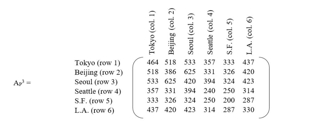
The first take-away from this matrix is that the number of paths between major cities has now grown again by another order of magnitude with the addition of a second layover. Therefore, as the number of layovers grows arithmetically, the number of possible paths grows exponentially! It may seem counter-intuitive but, unless all flights into a given country are forbidden (usually not practical) or travel restrictions are based on presence in an infected area within a specified time interval, cancellation of direct, non-stop, flights from an infected country may be the worst thing that can be done during a pandemic because it forces passengers, some of whom may be incubation carriers, into an enormous network of indirect flights to avoid flight restrictions; thereby maximizing the spread of disease. A better procedure is to channel as many travelers as possible into direct, non-stop, flights and test them before and after travel, with an appropriate quarantine period at each end. The route with the greatest number of travel options (and infection possibilities) is now Seoul to Beijing. Again, Incheon International Airport would be a likely location for early detection of a new infectious strain. However, some of the 625 possible travel itineraries between Seoul and Beijing are illogical for some travelers. For example, what tourist would consider the path Seoul → Tokyo → Seoul → Beijing when they could go Seoul → Tokyo → Beijing? Going back to Seoul forms an unnecessary loop, and it may be desirable to eliminate such redundant paths from the count as being irrelevant for this type of traveler. The word redundant is a technical term referring to paths containing loops (embedded cycles) and/or switchbacks (repeated edges). All such paths can be eliminated by calculating something called a redundancy matrix, denoted by RN (where the subscript N indicates the number of legs, or edges, of a path and is equal to 3 in this case), which can then be subtracted from the path count provided by A3 (AP3 in this example). What remains are non-redundant paths. Now, here is where things become tricky. Formulas exist for the direct computation of R3 and R4 from A, and even for R5 and R6, although the formulas for these last two redundancy matrices are very complicated. However, the real difficulty with all these formulas is that they only work when the entries of A are either 1 or 0. In the case of flights connecting two cities, there will often be more than one round-trip connecting flight. Furthermore, the flight count may change from year to year, and with the seasons. So, rather than trying to develop closed form expressions for RN that will quickly become obsolete as the connecting flight count between cities changes, an unpublished algorithm will be presented here that goes back to basics and employs combinatorics. Calculations will begin with the direct computation of the individual elements of R3 (RP3 in this example). First of all, R3 (i.e. RP3) has all zeros on its main diagonal. That is because only a simple cycle (no flight path reused) with no city (vertex) revisited (also called a circuit in the literature) can be made using 3 edges. In other words, there is no redundancy for a circuital journey involving 3 legs (2-stops)! It is important to realize that in general this will not be the case for N > 3. Next, comes the computation of all the off-diagonal elements of the redundancy matrix. This is not as bad as one might think, because the redundancy matrix is symmetric! That is to say, any redundant path between two cities can also be followed in reverse. That symmetry cuts the number of calculations in half. Suppose the analyst wishes to calculate RP3(2,3), representing all redundant paths between Beijing and Seoul that are 3 legs long. Clearly, by definition, the sequence of steps must begin with Beijing and end with Seoul (Beijing → X → Y →Seoul). But, what goes in between? If X is Seoul, then Y can be Beijing, Tokyo, Los Angeles, San Francisco, or Seattle; but not Seoul again because there are no flights from Seoul to itself. Suppose Y = Beijing, how many redundant paths exist? There are 6 paths from Beijing to Seoul (see Figures 3A and 6), and 6 more paths from Seoul back to Beijing, followed by another 6 paths to Seoul. That makes 6 × 6 × 6, or 216 possible redundant paths. The other selections of Y yield 96, 24, 6, and 24 additional redundant paths respectively, for a sub-total of 216 + 96 + 24 + 6 + 24 = 366 redundant paths. What if Y is fixed at Beijing? Then X can be Tokyo, San Francisco, Seattle, or Los Angeles; but not Seoul because that has already been counted. The sub-total number of redundant paths produced by Y = Beijing is 96 + 6 + 6 + 24 = 132. Therefore, the grand total is 366 + 132 = 498 redundant paths. Therefore, RP3(2,3) = 498 = RP3(3,2). The complete RP3 matrix is displayed in Figure 9.
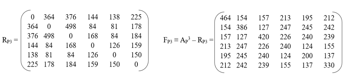
The difference between the matrix elements of AP3 and RP3 yields the number of non-redundant paths between any two cities for paths that are 3 legs long (i.e. have two layovers). This new matrix will be called the fundamental matrix for paths of length 3, and will be denoted by F3(i,j), or FP3(i,j) in this example, and is displayed in Figure 9. If i ≠ j, these non-redundant paths are called ways. While the diagonal elements FP3(i,i) yield the number of non-redundant cycles (called circuits), 3 legs long, that bring you back home to your starting city i. For example, the matrix element FP3(5,5) is just the number of circuits 3 legs long that start from San Francisco and bring a traveler back to San Francisco. FP3(5,5) = 200, and there are indeed 200 non-redundant paths as the reader can verify. To avoid any confusion with the literature, the reader should note that there is a matrix called a way matrix W3(i,j), and for i ≠ j W3(i,j) = F3(i,j), but for all i = j W3(i,i) ≡ 0; so, the way matrix contains only ways (paths for which no edge or vertex is revisited), while the fundamental matrix contains both ways and circuits (paths for which no edge is revisited, but the first and last vertex are identical). At this point the reader may wonder if there is an independent method for cross checking the entries of FP3? Yes, there is! Continuing with the example above involving travel between Beijing and Seoul, the matrix element FP3(2,3) indicates that 127 non-redundant (simple) paths exist between these two cities. These paths can be counted directly without subtracting the number of redundant paths from the total number of paths. Again, by definition, the sequence of non-redundant paths must begin with Beijing and end with Seoul (Beijing → X → Y →Seoul). Between these two endpoints there are two cities, and it is necessary to calculate the number of paths for all permutations of those cities. There are 4 chose 2 such permutations, or 4! / (4 – 2)! = 12 permutations, and they are:
- 4 × 3 × 2 = 24 non-redundant paths Beijing → Tokyo → Los Angeles → Seoul
- 4 × 2 × 1 = 8 non-redundant paths Beijing → Tokyo → San Francisco → Seoul
- 4 × 2 × 2 = 16 non-redundant paths Beijing → Tokyo → Seattle → Seoul
- 2 × 3 × 4 = 24 non-redundant paths Beijing → Los Angeles → Tokyo → Seoul
- 1 × 2 × 4 = 8 non-redundant paths Beijing → San Francisco → Tokyo → Seoul
- 1 × 3 × 2 = 6 non-redundant paths Beijing → Seattle → Tokyo → Seoul
- 2 × 3 × 2 = 12 non-redundant paths Beijing → Los Angeles → Seattle → Seoul
127 total non-redundant paths. There are no other permutations. Therefore, the total number of non-redundant paths is 127, in agreement with the value of FP3(2,3) computed by subtracting the redundancy matrix from the adjacency matrix cubed. So, the analyst can be quite sure that all the arithmetic has been done correctly. Note that there are also 12 permutations for journeys that start from San Francisco and return to San Francisco in 3 legs (2 layovers) and, if all the arithmetic is done correctly, the total number of non-redundant paths (circuits) will be 200, the value of the matrix element FP3(5,5).
The next question is, What about paths that are 4 flights long, involve 5 cities, and have 3 layovers? How many paths do they generate? In this case it is best to generate the matrix elements of the fundamental matrix directly. Again, consider traveling from Beijing to Seoul (Beijing → X → Y → Z → Seoul). Since Beijing and Seoul have already been used as the first and last cities, X, Y, and Z can only be Tokyo, San Francisco, Seattle, or Los Angeles. How many ways can X, Y, and Z be selected from these 4 cities. The answer is 4!/(4-3)! = 4!/1! = 4! / 1 = 4 × 3 × 2 × 1 = 24 permutations. Although there are now twice as many permutations, the matrix elements of FP4, the total number of non-redundant paths (ways) and circuits 4 legs long, can still be calculated manually as in the previous paragraph for FP3. If the number of redundant paths is of interest, these can be easily obtained by subtracting FP4 from AP4. What about paths 5 flights long (e.g. Beijing → W → X → Y → Z → Seoul). Business travelers might do something like this. Now the number of permutations is 4!/(4-4)! = 4!/0! = 4!/1 = 4! = 24 again. If even longer journeys are contemplated, there aren’t enough cities to guarantee the existence of a non-redundant path. The diagonal elements of FN(i,i), regardless of whether the fundamental matrix applies to the North Atlantic, the Pacific Rim, or the globe, are of special interest because most travelers eventually want to return home following a simple circuit without revisiting cities. The sum of all the diagonal elements yields all possible circuits of length N (N flights). This sum is called the trace of FN, and is denoted by tr(FN). Whatever the regional or global flight schedule is between cities, the larger the trace, the greater the risk of spreading an infection for circuits of length N. For a region with 6 major cities, N can be no greater than 6. Therefore, the total infection risk RT is proportional to a sum over N, viz.
N = 6
RT ∝ tr(A2) + tr(F3) + tr(F4) + tr(F5) + tr(F6) = tr(A2) + Σ tr(FN), (1)
where the upper limit on the summation over N will, in general, be one less than the number of cities considered. Reduction of the notion of risk to a single proportionality for regional or global air travel is an important result because it allows the analyst to select the safest flight network among a set of such networks. As a simple example, consider Pacific Rim circuits that are two and three edges long. These are some of the most common cycles for travelers. In that case equation 1 can be truncated after the second term. From Figures 7 and 9, RT ∝ tr(A2) + tr(F3) = 254 + 2040 = 2294. Now suppose that one flight of the critical route between Beijing and Seoul is cancelled. In that case, since the resulting network is just a sub-graph of the original, it must possess a total infection risk smaller than the original network, call it RT. Repeating the calculations above, and noting that only the diagonal elements AP′2(i,i) and F′P3(i,i) of the sub-graph are required, yields RT ∝ 232 + 1902 = 2134, a smaller value for the infection risk (RT < RT), as would be expected. However, the 7.0% decrease in infection risk (via a decrease in the number of travel circuits) has been achieved by cancelling just one flight between Beijing and Seoul in this very infection sensitive part of the world. Cancelling one flight is equivalent to decreasing the total number of flights for the whole network by only 2.6%; where the total number of flights is the sum of the matrix elements above (or below) the main diagonal of AP, i.e. Σi Σj AP(i,j) for all j>i. Therefore, surprisingly, the spread of infections can be decreased significantly with negligible decreases in passenger throughput by prudent scheduling changes. Now, what would happen if an extra nonstop flight from Beijing to Los Angeles were added, while a nonstop flight from Tokyo to Los Angeles is eliminated? Now which network is most resistant to the spread of disease? Clearly, equation 1, or some similar metric for RT, that depends on the matrix elements of AN, RN, and/or FN is required to answer such questions objectively. The number of such rules being limited only by human imagination and the requirements of the specific problem to be addressed.
The bottom line of this discussion on matrix methods is that the adjacency, redundancy, and fundamental matrices are powerful tools. They can be used to identify risky travel behavior and risky airline scheduling. They can also be used to identify cities where infections are likely to be observed first during the early stages of a pandemic. As everyone knows from the economic and social difficulties of the lockdown, even during a pandemic, life must go on! Some travel is inevitable, but flight schedules and travel behavior can be modified to mitigate the risk of spreading infection. Furthermore, genomic surveillance in early warning cities like Seoul and London, tells governments and airlines when it is time to initiate changes. Although matrix methods are well suited for calculating the risk of spreading disease via air travel (Figure 2 black lines – solid, dashed, and dotted), they don’t tell us everything we would like to know about the spread of disease. As Figure 2 shows, there are other factors to consider population migration, both legal and illegal (Figure 2 arrows in black outline), and the circulation of disease (Figure 2 curved gray arrows). The description of that part of the COVID story will require very different tools the mathematics of chaos, and unstable sets of nonlinear differential equations.
The Current Human Diaspora
The Southern Hemisphere and the parts of the Northern Hemisphere south of the U.S. and Europe were an important source of COVID vectors. In the Western Hemisphere (Figure 2) the migration of human populations, especially undocumented (illegal) aliens, through America’s porous southern border introduced millions of people into the U.S. whose health status was unknown. However, testing of individuals who were arrested by U.S. Customs and Border Protection as they attempted the crossing, indicated that during the peak COVID years (2021 and 2022) about one-third were infected by the time they reached the border. Most of these migrants come from Mexico, the Central American states, and heavily infected South America. Some come from even further away. Fleeing war, drug related violence, and poverty, they enter South or Central America first, and then travel north. In Europe (Figure 2), Spain, Italy, and Greece, were on the front-lines of the immigration surges from Africa, the Middle East, and Asia in general. Resentment was high. In Sicily, the local people would say, Compra, Morta (you buy, you die) a reference to the fact that many migrants who entered Italy along the South Africa-Tunisia-Pantelleria Is.-Sicily migration route end up as street peddlers in Sicilian cities. In Spain the passage from all of Africa, through Morocco, across the Strait of Gibraltar, and into Spain is another obvious migration route into the European Union (EU). However, eme-once (M-11) referring to the March 11, 2004 jihadist terrorist attack in which 10 simultaneous explosions on four commuter trains in Madrid killed 191 people and injured more than 1,800 others left a negative impression of Muslim North African (magreb) migrants in the mind of many Spaniards, especially in Madrid. It was the worst terrorist attack in European history, and is still recognized as a day of mourning 20 years later in Spain. Some Spaniards will talk about it, but most are hesitant to express their feelings to people they don’t know. Finally, Greece has become another gateway into the EU. Middle Easterners, Africans, and Asians make their way through Turkey into Greece and beyond. Migration had already reached the 1 million mark by 2015. Many make their way to the Greek islands, but thousands have died at sea in the attempt. The recent fighting in Gaza has seen a 400% increase in migration into Greece in the February to March 2024 time-frame. Although France is not on a direct migration route into Europe, it has experienced a significant African immigration that is most obvious in the suburbs south of Paris (e.g., from Parc Médicis to Le Delta in the Rungis neighborhood).
The Chaotic Behavior of Epidemics/Pandemics
Some Questions: Diversity analysis suggests that the appearance of omicron BA.2.86 in Israel and Denmark originated in South Africa together with the other omicron strains BA.1 through BA.5. Therefore, it seems likely, or at least plausible, that the migration route through the Middle East may have been instrumental in the spread of BA.2.86 into Israel (one of the black arrows in Figure 2), while air travel may have been involved for the spread into Denmark (see air-route maps Figure 1 of reference 45). Graeme Dor and his colleagues raise the following interesting question, How is it possible that despite its relative remoteness and the fact that it is home to only 0.7% of the world’s population, South Africa has had a disproportionately large impact on SARS-CoV-2 evolution and spread? Still more surprising is that the beta-strain also originated in South Africa! The short answer to the question raised by Dor et al. is that the omicron strains simply out-competed beta and the other strains. What, however, does that actually mean for a virus? A question that will be answered immediately.
Initial Growth (A Simple Discrete Model): Let MICLP be the Mean Incubation Carrier Latency Period, during which each vector attempts to infect m other people; a period of about 5 days before symptoms and isolation. Furthermore, let א0 be the initial number of infected people in a population of size N, and let אp be the number of infected people after p MICLP time periods, where p is an integer. Define the growth rate r as the mean relative increase per MICLP:
r ≡ (אp+1 – אp) / אp, where r > 0.
Therefore, אp+1 = (r + 1) אp.
Therefore, if r is constant, אp = (r + 1)p א0.
Alternately, if t is the total time elapsed from the start of an infection measured in days, then a dimensionless time measure τ can be defined such that τ ≡ t/MICLP. Therefore, by the definition of m, mτ 0א = pא, where τ may be rounded off to make it an integer like p. Comparing equations 4 and 5 yields m = r + 1, or r = m – 1. This simple, but important, result means that the viral strain with the largest m will have the largest mean relative increase per MICLP, and will out compete all other strains. For the alpha strain, m ≈ 3 and r ≈ 2. Therefore, the delta strain has ~6 m ~12 and ~5 r ~11. For omicron, ~15 m ~45.6 and ~14 r ~44.6. Here, the symbol ~ means approximately, while ≈ means approximately equal to. These figures for m and r will be of great value for the calculations that follow.
Steady State Behavior and the Frontier of Chaos (The Discrete Verhulst Model for an Isolated Population): Obviously, the growth in equation 5 cannot continue forever because susceptible individuals will be consumed by either death or the development of natural immunity upon recovery. Artificial vaccination will also speed the development of herd immunity. While the warm summer months can retard the growth of respiratory infections. Finally, a strain can die out because it is replaced (out-competed) by a new strain with an even larger m, as previously discussed. Eventually, the number of active cases must level off. A good example of leveling behavior due to these factors is offered by the first and second waves of COVID in the U.S. prior to September 26, 2020. If population immunity continues to grow, the number of cases per day will eventually crash. An example of this was the abrupt drop in the number of active cases in the U.S. following the omicron peak. Here, Verhulst dynamics will be used to model observed leveling behavior. It will be assumed that equation 2 is replaced by r (1- [אp / אmax]) = (אp+1 – אp) / p, where אmax is the limiting (maximum) number of active cases. That is to say, the left side of equation 2 is no longer just a constant r, but approaches zero as אp → אmax and p → ∞. It is important to remember that equation 6 is just a model that mimics the behavior of a much more complex process, and is not the process itself. Notice also that both sides of equation 6 are dimensionless. That is a significant point that will be revisited in the next section. Equation 6 can be rewritten as:
אp+1 = r אp r (אp2 / אmax) + p.
Since אmax can be anything, equation 7 will be normalized by dividing it by אmax to facilitate calculations. Therefore, equation 7 becomes:
אp+1 = r אp r אp2 + p,
where אp+1 ≡ אp+1 /אmax, and אp ≡ אp /אmax. Equation 8 can now be rewritten as:
אp+1 = (r + 1) אp r אp2, where r > 0.
Dimensionless equation 9 allows the subcritical, critical, and supercritical behavior of the Verhulst model to be studied. Figure 10 shows what happens to אp as p → ∞ for various values of r, starting from an initial value 0 = 0.1. Note that 0 ≠ 0, because 0 = 0 means there is no disease to start with. Therefore, a truly isolated population will have no disease in the future. Therefore, אp+1 will also equal zero, as can be verified by inspection of equation 9. Starting with a subcritical value of r = 1.9, אp overshoots at first, then undershoots, and then eventually settles down to the steady state value of unity. This was happening during the third COVID wave in the U.S. before its oscillations were cut off by the growth of the delta wave. The damped oscillatory behavior can be better understood if the departures of אp from unity (call them δp) are tracked as p → ∞. Let אp = 1 + δp, then אp+1 = 1 + δp+1. Substituting these values for אp and אp+1 into equation 9 yields:
1 + δp+1 = (r + 1) (1 + δp) r (1 + δp)2.
Expanding, ignoring the terms of negligible size in δp2, and recollecting, yields:
δp+1 = r δp.
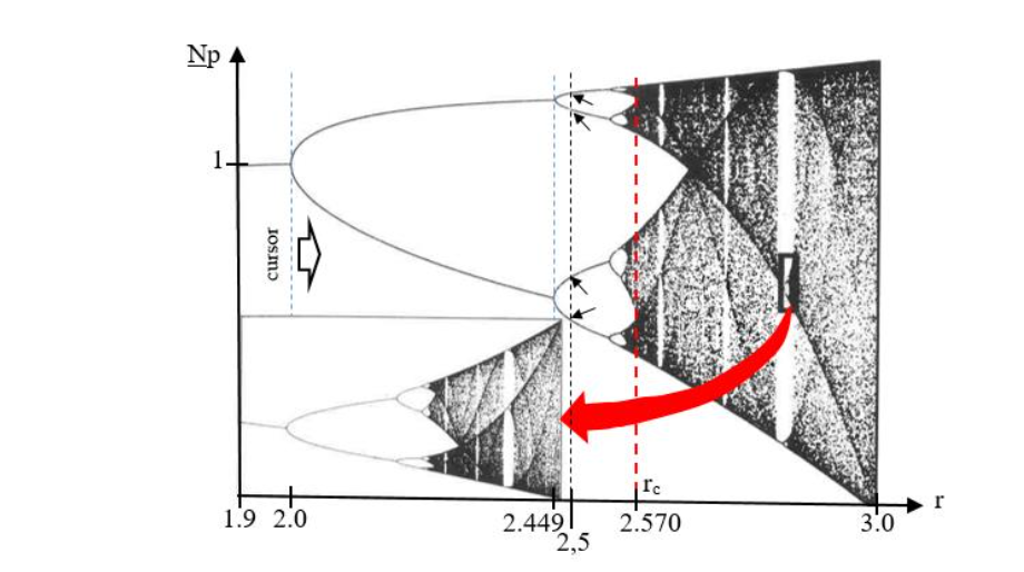
This simple approximation shows that there is no overshoot when 0 < r < 1, because the departures δp form a monotonically decreasing series, or 0 if r = 1. Above r = 1, overshoot grows as r → 2. At r = 1.9, δp+1 = 0.9 δp. Therefore, the deviations alternate in sign and decrease in magnitude as p → ∞ and אp → 1. For r = 2.3, the Verhulst model begins to show critical behavior, as אp oscillates between two values as p → ∞; one value at אp ≈ 1.18, and the other at אp ≈ 0.69, such that the old steady state at אp = 1 is asymmetrically bracketed. So long as 2 < r < 6, 2.449, only two stable values of אp will exist. Although the alpha strain was first detected in the U.S. in November 2020, it did not become dominant until March 2021. The first two COVID waves in the U.S. each achieved a stable number of active cases, and were primarily the original SARS-CoV-2 strain; something close to B.1 that is sometimes called L.
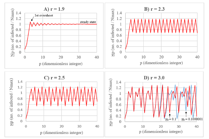
At r = 2.5, four steady state values appear. When r > 2.570 (called the critical value, rc), chaotic behavior sets in (see Figure 10D for r = 3), and the value of אp appears to fluctuate randomly around the original steady state value אp = 1 (called a strange attractor), but within bounds. This behavior is what might be expected for the delta and omicron strains, making it very difficult to predict the future number of active cases, or the amount of medical supplies that will be required. Another chaotic behavior is the variable number of integers (proportional to time) between deep troughs; it’s like the variable duration of annual COVID cycles. It is significant that the behavior of the Verhulst model is very sensitive to the value of r near 2.570, with small changes resulting in the multiplication of steady states. Figure 11 shows the splitting (or bifurcation) diagram for the number of steady states as a function of r for this system. This curious diagram contains an infinite number of holes, like a thin piece of Swiss cheese with an infinite number of holes of various sizes. If a vertical cut through this diagram is made at rc = 2.570 (red dashed vertical line in Figure 11), at no point will it be a truly continuous one-dimensional line, even though its points mark off an infinite number of states! Such a cut has a dimension that is less than one. Its Feigenbaum dimension is 0.538 it is fractionally dimensional, and it is for this reason that the bifurcation diagram is called a fractal. Stranger still, Figure 11 possesses a property of self-similarity in the sense that a microscopic piece of the diagram is a copy of the whole! It is also significant that the chaotic behavior of the Verhulst Model is very sensitive to initial conditions. If א0 = 0.1000001 instead of 0.1, a change of only one part in a million, Figure 10D shows (blue) that after 19 iterations the values of אp will begin to diverge from the original values (red). After 40 iterations the calculated values of אp are completely out of phase with one another. Therefore, the introduction of even a single new COVID case involving a strain with sufficiently large r (and therefore m) into an isolated, but previously infected, population can completely change the future course of a pandemic in that population. This phenomenon is called the butterfly effect for reasons that will be discussed presently.
The Infection-Convection Analogue (An Analytic Model for Circulating Populations)
The use of system analogy is a well-established principle of engineering that forms the foundation of systems analysis. For example, an electrical inductor is analogous to a mechanical spring, a resistor is analogous to a mechanical viscose damper, and a capacitor is analogous to a mass. In this section, the spread of disease over the surface of the earth will be modeled as two-dimensional convection in a vertical slab of fluid heated from the bottom. Such a physical process is governed by the Lorenz equations a coupled set of three non-linear differential equations that have been used to model the behavior of lasers, dynamos, chemical reactions, and electric circuits. The Lorenz model also seems particularly applicable for describing the circulation of infected people (vectors) between neighboring countries in Eurasia and North America, or over the Atlantic and Pacific flight paths. People are neither created nor destroyed during these circulations in the same way that mass is neither created nor destroyed during the convection circulation of an approximately incompressible fluid. Therefore, the population between neighboring states (in a geographical or flight sense) remains the same on the average. Therefore, neighboring states form an infection convection cell. The source of heat for this cell are the infected people in the source country. As hot infected people leave the source, cold uninfected (or relatively uninfected) people from the target (uninfected, or relatively uninfected) country replace those who left the source on the average, because in the end everyone must return to their nation of origin. This process is, of course, analogous to the physical convection process where low density hot fluid rises while cold dense fluid sinks to replace it, and gravity supplies the driving force for the circulation of mass. In the case of an epidemic on a local scale, or a pandemic on a global scale, it is the concentration gradient of infected people that supplies the driving force for the spread of infection, just as a molecular concentration gradient supplies the driving force for the diffusion of molecules in chemistry (the chemical potential).
Continuing with this infection-convection analogy, let I be a dimensionless variable proportional to convective intensity normally measured in watts of heat transferred, or the number of people leaving a source country per MICLP. Furthermore, let ΔT be a dimensionless variable proportional to the temperature difference between the ascending and descending currents during fluid convection, or the difference in the number of vectors between departing and returning travelers per MICLP (call it Δ). Finally, let D be a dimensionless variable proportional to the distortion of the vertical temperature profile from linearity, such that a positive value indicates that the strongest gradients occur near the upper and lower fluid boundaries while a negative value of D indicates the reverse. Or, from an epidemiological point of view, D represents departure in the number of vectors from a linear gradient that has a large number of infected people in the source country and a small number of infected in the target country. In terms of these dimensionless variables, the coupled Lorenz equations can be written as:
dI/dτ = σ(ΔT – I)
dΔT/dτ = I(ρ D) ΔT
dD/dτ = I ΔT βD,
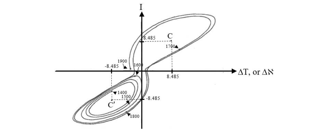
where the derivatives dI/dτ, dΔT/dτ, dD/dτ, are simply the change in I, ΔT, and D with respect to τ, a dimensionless time measure used in fluid mechanics. For epidemiological purposes, τ will simply be the time measured in dimensionless MICLP units (i.e. τ ≡ t/MICLP). Here, it is important to note that equations 12 are dimensionless, just like equations 6 and 9 above. In fluid mechanics, the dimensionless constants σ, ρ, and β, are the Prandtl number (the ratio of fluid dynamic viscosity to thermal conductivity, multiplied by the constant specific heat capacity to make the ratio dimensionless), the Rayleigh number divided by a critical constant (a measure of fluid layer turbulent instability), and a geometric factor related to the aspect ratio of a convection cell, respectively. For this report the interpretation of β remains the same for the infection convection cell, and the Saltzman/Lorenz value of 8/3 will be retained. The infection convection cell is much larger than a two-dimensional fluid convection cell, but the ratio of its length to its width will be taken as constant. Furthermore, ρ is still a measure of instability in the sense that the more infectious a disease is (the larger its value of m), the more likely it is that the infection will spread in a turbulent and unpredictable way (i.e. ρ is a function of m, ρ = f(m)). Here ρ is analogous to r in equation 9, and the Saltzman/Lorenz value of ρ = 28 seems a reasonable model for omicron. Finally, travel is not instantaneous. There are schedules that cannot be exceeded, layovers, delays, passenger limitations on flights, etc. All of these obstacles form a kind of travel viscosity, or speaking electro-mechanically, they constitute resistance or viscose damping. While thermal conductivity (the diffusion of heat) is analogous to the slow diffusional spread of infection without traveling (i.e. neighbor to neighbor transmission). So, the Prandtl number (σ), a measure of the relative importance of viscose to thermal effects, can be interpreted epidemiologically, and the analogy between fluid convection and the spread of disease is complete. For a compressible gas like air σ < 1, but for an almost incompressible fluid like water σ = 7.56. It is this latter incompressible case that applies to the spread of disease. Therefore, the Saltzman/Lorenz value of σ = 10 seems reasonable when modeling the circulation of disease vectors. The solution to the system of equations is well known, and is presented graphically in Figure 12 for σ = 10, ρ = 28, and β = 8/3. Each point on the curve represents a solution to equations 12 at a particular point in time. As dimensionless time τ progresses, the curve evolves and orbits around two centers (C and C′) chaotically, flipping back and forth between the two, but remaining confined to a bounded region of I, ΔT, D space. Notice that I can be negative, meaning that flow in the convection cell has reversed. So long as I and ΔT have the same sign warm fluid is ascending and cold fluid is descending. The opposite is true for positive I and negative ΔT. Such a phenomenon is physically possible momentarily if too much heat is added to the bottom of a vertical two-dimensional fluid system so that convective circulation becomes chaotic, thereby allowing for random flow reversals. By analogy, if the current of travelers exceeds the capacity of the target nation’s port of entry, an infection can back up into the source nation. Similar conditions were met along the U.S./Mexico border during the pandemic as migrants waiting to enter the U.S. accumulated in border cities like San Luis Rio Colorado, Agua Prieta, and Nogales, Mexico; to be discussed in more detail in the next section. Epidemiologically, chaotic behavior means that it is impossible to predict the future course of an outbreak of any highly infectious disease (ρ >> 1) beyond setting broad limits on infection levels. It’s like trying to make accurate long-term predictions about the weather in a convective atmosphere! Each center (C and C′) in Figure 12 is a strange attractor, and represents a stable solution to equations 12. That is to say, steady state convection for either the spread of disease, or the spread of heat by convection in a vertical fluid slab. The I, ΔT, D coordinates of these strange attractors are easy to calculate because stable convection means dI/dτ = dΔT/dτ = dD/dτ = 0. Therefore, equations 12 become:
σ (ΔT – I) = 0,
I(ρ D) ΔT = 0,
I ΔT βD = 0.
Solving this new system of equations by simple algebra yields I = ΔT = ± (β [ρ – 1]) and D = ρ – 1. Substituting in the values of the dimensionless constants yields D = 27 and I = ΔT = ± 6 ± 8.485, as can be seen in Figure 12. Note that no convection at all corresponds to the solution I = ΔT = D = 0.
The onset of the chaotic behavior just described is largely determined by ρ. If the values of σ and β remain constant at 10 and 8/3, respectively, unstable chaotic behavior will begin at the critical value ρc = 470/19 ≈ 24.74. Values of ρ above ρc are called supercritical (as in the previous section), those below are called subcritical; and, of course, ρc is analogous to the Verhulst rc. Subcritical solutions to equations 12 are well behaved and orbit around either the C or C’ strange attractor when 1 < ρ < ρc. That is to say, convection of fluid mass, or disease vectors, will oscillate in I, ΔT, D space around one attractor in a predictable way until I, ΔT, and D, settle down to that steady state attractor value. Small changes in ρ near ρc can affect the behavior of the solutions to equation 12 dramatically, as in Figure 10 for the more easily understandable Verhulst model. In addition, like the Verhulst model, the Lorenz model also displays sensitivity to initial conditions. Any small change to the starting values I0, ΔT0, and D0 in figure 12 will be amplified over time so that after a sufficiently long period, the final values of I, ΔT, and D will be completely different. That is to say, a small change to the initial state of the system does not result in a small change to the final state. This is the butterfly effect of the Verhulst model referring to the idea that even the flapping of a butterfly’s wings can change the weather in a convective atmosphere far enough into the future. Once again, even a single case of beta, or omicron, in a remote, underpopulated location like S. Africa, has global implications if enough time has passed. Dr. Tlaleng Mofokeng of South Africa was quite right to be concerned about the lack of COVID vaccine in Africa. The result of this neglect was calamitous! In the future, it would be wise to establish regional stock piles of vaccines and other medical supplies from the very beginning of an outbreak, on a regional population basis, to prevent this type of imbalance from occurring again. Although the calculations of the previous two sections explain many of the observed behaviors of the COVID-19 pandemic, all models have their limitations, and these must be addressed before closing this section. It has been tacitly assumed that for convection in a vertical slab of fluid, the temperatures at the top and bottom of the slab remain constant. However, in most closed systems, the fluid will eventually heat up, unless some special provision is made to prevent that from occurring. The same is true during a pandemic as a highly infected country slowly spreads disease to its neighbor. Therefore, the infection-convection model cannot be run for too long, and must be confined to a narrow window in dimensionless time τ, as in Figure 12. Another obvious limitation is that the behaviors of the Verhulst and Lorenz models apply to a single strain with fixed m. When multiple strains are present either simultaneously, or separated in time, behaviors might overlap in a complex way that is outside of the descriptions presented here.
Lessons Learned from Around the Globe (traveling west from the U.S.)
Southwestern U.S. / Northwestern Mexico: Although the U.S southern border was theoretically closed, the reality was a porous border through which millions of migrants passed. In 2021 (the year of the delta wave) 1.4 million people tried to illegally cross the U.S/Mexico border, and in 2022 (the year of the omicron wave) 2.4 million tried to cross the border.⁵⁶ Many of these migrants remained in the U.S. by legal device and lengthy court proceedings. Of the 3.8 million that were intercepted in 2021 and 2022, one third were sick by the time they reached the U.S. border.⁴¹ However, the intercepted migrants comprise only a fraction of total illegal migration. It has been estimated that about 11.8 million “unauthorized immigrants” live in the U.S. as of Aug. 2025.⁵⁷ In addition, legal immigration proceeded at a brisk pace during 2021 and 2022 with about 1.5 and 2.6 million entering the U.S. respectively; an average of 341,666 people per month over this two-year period.⁵⁸ Health checks must have been few if any, since, on the average, 1.3 people entered the U.S. every 10 seconds! In Nogales, Arizona, the chain of people entering and leaving the border station was often continuous. However, the damage didn’t stop there. During the first week of September 2024, in Phoenix, Arizona, the author witnessed migrants being transported, in a new cross-country bus from a large 4* star hotel near the intersection of Interstate Highway 10 and Baseline Road, to other parts of the U.S. Each had spent the previous night at the hotel, was fed breakfast in the morning, and given a new cell phone for their journey. Nothing more could have been done to spread COVID! Figure 13 summarized the result. The message is quite clear. The U.S. southern border from San Diego, California, to Corpus Christi, Texas, had become heavily infected, as migrants buried themselves in densely populated border metropolises, or sought work in agricultural areas. And what was the U.S. CDC’s reaction to these irresponsible, bizarre, and suicidal policies? – Absolute Silence! How can anyone wonder why the U.S. had more COVID cases than any other country in the world?
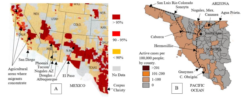
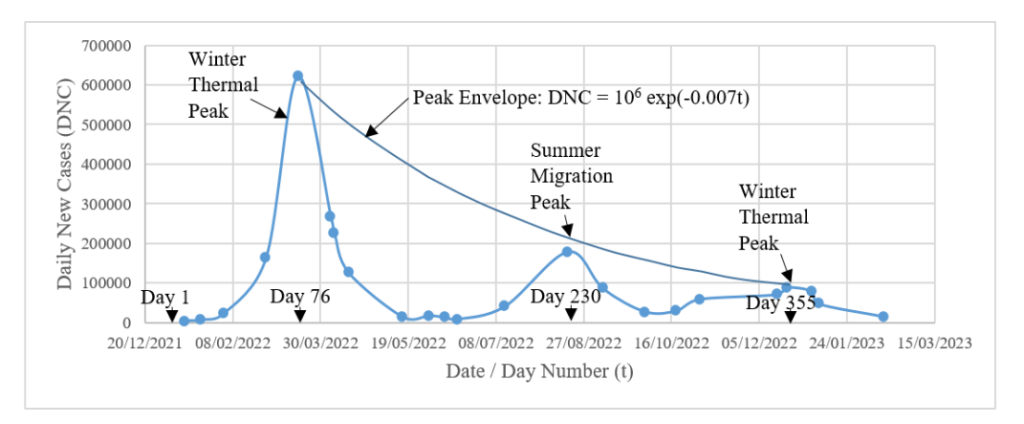
Figure 14 – Daily new cases versus time for South Korea.⁷¹ Peak heights (Daily New Cases – DNC) show an exponential decrease, where time t is the day number of the year, and New Year’s Day 2022 = day 1.
There is no secret as to how the Korean’s tamed COVID, and as of May 2024, people in Seoul were still vigilant even if the government didn’t require it (see Figure 15A)! Furthermore, as of that same date, all passengers flying into S. Korea from abroad were required to fill out a “Health Declaration Form” (Figure 15B). Finally, it should be noted that the fatality rate from COVID in S. Korea was only 0.1%, compared to 1.2% in the U.S. The low fatality rate can be traced to the high rate of vaccination in S. Korea and the country’s outstanding and well-equipped hospital system.⁶⁶
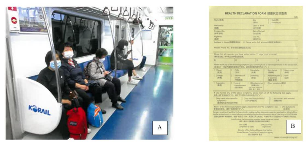
Figure 15 A) This is something you will not see in the U.S. – a subway car full of riders all wearing masks. In Asia, there is no stigma attached to wearing masks in public places! Photo by the author on line 4 in Seoul, May 8, 2024.
B) The “Health Declaration Form” required of all travelers flying into Korea (given to the author on May 5, 2024).
With the current relaxation of restrictions, COVID is on the rise again. S. Korea had 433 hospitalized COVID-19 patients from Aug. 31 to Sept. 6, 2025.⁷² Globally, XFG is the dominant strain, and accounted for 67% of sequenced cases for the week ending August 10, 2025.⁷³ The second most common strain is NB.1.8.1,⁷⁰ though its prevalence is decreasing; presumably it is being out-competed by XFG. Reliable and complete data on active COVID-19 cases is increasingly difficult to obtain as many governments and health organizations have scaled back surveillance efforts – a *big mistake!*⁷⁴
China. Although the COVID-19 pandemic started in China, few countries on Earth have done more to suppress its spread.⁷⁵ Briefly, here is how the “Zero-COVID Policy” worked. During the pandemic, if even one case of COVID appeared in a “neighborhood”, the entire neighborhood was quarantined. Some neighborhoods in Beijing have perhaps 5 or 10 thousand people because of the presence of high-rise apartments, but many neighborhoods in China are smaller. A resident of Beijing could check the quarantine status of their neighborhood on the internet – green indicated open (safe), while red indicated quarantine. If you ask the average person on the street in Beijing if this procedure worked to control the infection, that person will probably say, “NO!” Perhaps mathematics can shed some light on this response.
Let 𝒩 be the total number of people in a large population, and let m equal the number of people that each infected person can, in turn, infect in this same population. Furthermore, let this population be divided up into n neighborhoods that are completely isolated from one another in the sense that an infected individual in one neighborhood cannot infect someone in another, and let each neighborhood contain 𝒩/n people, where n ≪ 𝒩. If t is the total time elapsed from the start of an infection (in either 𝒩 or 𝒩/n) measured in days, and MICLP is the mean incubation carrier latency period (during which each vector attempts to infect m others), then as before τ ≡ t/MICLP is the dimensionless elapsed time measured in MICLP units of about 5 days each.
Starting with N₀ = 10 infected people in a theoretically infinite population 𝒩 at τ = 0, it would be found that the number of infections grows at a rate 10·m^τ. However, if those initial 10 people are uniformly distributed over n = 10 small neighborhoods of 𝒩/n = 100 people (1/neighborhood – a worst case), then growth of the infection will be slower because after each MICLP there will be less susceptible people left in a small neighborhood, since each infected person will either die (not likely) or recover and become immune (likely). Now the infection within each neighborhood will grow as the sequence 1, (99/100), {(100 − (99m/100 + 1))/100}(99m/100), … etc. as a function of τ, and the infection for all ten neighborhoods will grow as 10 times this sequence. As a realistic example let m = 3, then Figure 16 emerges. Notice that the reduction in the total number of infections is 16.85% after only 3 MICLP time units (~15 days), and this reduction will grow as τ continues to increase. The question the reader must ask is, “Will the average citizen notice such a drop?” The answer is, “probably not.” However, to a COVID nurse running out of hospital beds, an improvement of almost 17% could be life-saving! Although initially successful from a purely mathematical and medical point of view, the Zero-COVID Policy faced significant challenges as more transmissible variants like omicron emerged. This strain was so contagious that it became impossible to define an isolated self-contained neighborhood. There was no such thing as far as omicron was concerned! Challenges to the Zero-COVID Policy also came from the public, because there is more to fighting a pandemic than infection statistics alone. Isolation leads to economic loss, collateral mental and physical health issues, and social unrest. Anti-Zero-COVID Policy demonstrations had been reported in several cities in China.⁷⁶ It is difficult to say just how effective these demonstrations were in convincing the government in Beijing to change its strict COVID policy. A demonstration in China is not the uncontrolled mob that it is in the U.S. Demonstrations are by permit only, and are limited in size. Nevertheless, the mere existence of such a demonstration might send a message to the PRC government that it needs to address an urgent issue.
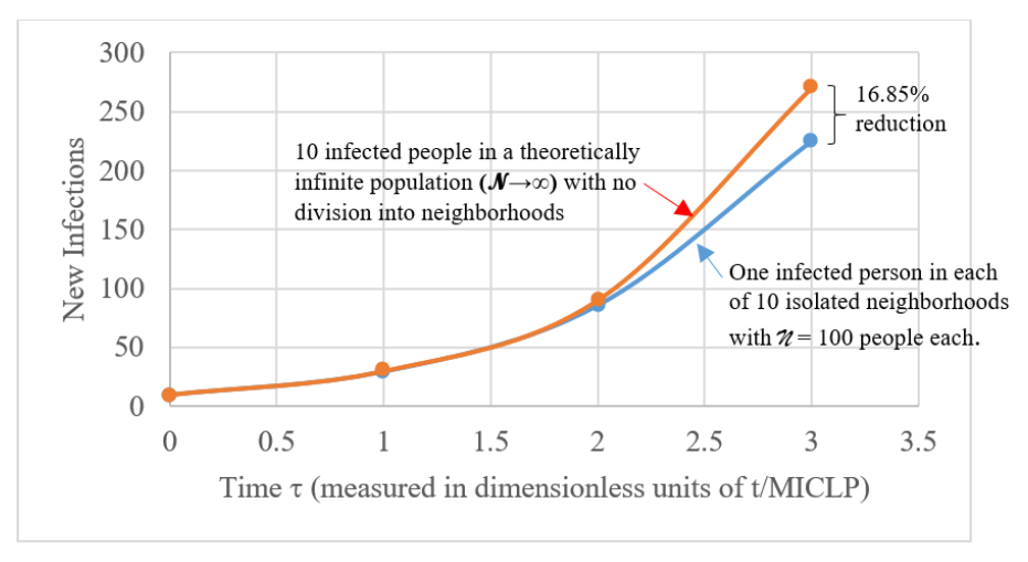
Figure 16 – The reduction in the number of infections due to division of a large population into “neighborhoods” as a function of τ = t/MICLP. Each MICLP time unit represents about 5 days, the incubation carrier period. After that an infected individual will show symptoms and be considered isolated until recovery and immunity. The next infection cycle begins with the people infected in the previous cycle, etc.
India: “We let our guard down when the variants were spreading. It was the worst time to do so.” – those were the words of T. Jacob John, a virologist working in Vellore, India.⁷⁷ By Apr 2021 the Delta variant was spreading, and India was caught with its masks down. As previously discussed, the same thing happened in S. Korea with the omicron strain just 7 months later. A similar mistake was made in the U.S.⁷⁸ The take-away from these examples is obvious: even if public health authorities think an epidemic or a pandemic has run its course, there needs to be a delay in the repeal of strict public health measures. A year of continued vigilance would not have been unreasonable for COVID because of the rate at which this virus was mutating. Had this been done, much of the pain of the Delta and omicron strains could have been avoided.
Turkey: This was one of the few countries in the world that was largely spared the ravages of COVID – up until March 4, 2020.⁷⁹ How did they do it? The answer is simply that they immediately closed their eastern border to travelers. Before the first confirmed case in Turkey, Iran already had 43 cases with eight deaths.
That was enough to prompt Turkey to close all four of its land border gates, and suspend all train and flight service with Iran as a preventative measure.⁷⁹ In fact, even before closure, Turkey had already intensified precautions at the border. Authorities in Van, a popular destination for Iranian tourists in eastern Turkey, installed thermal cameras at the Kapiköy border crossing, while border officers in contact with visitors were ordered to wear protective gear.⁷⁹ Amazingly, Turkey also successfully evacuated 32 Turks from Wuhan on Jan 26, 2020. Although these proactive measures may not have stopped the COVID infection completely, they were successful at slowing the spread of the virus sufficiently to keep it under control until vaccines became available. Clearly, prompt early action together with a sensible border policy were very effective!
The Navajo Nation / U.S.: Although not usually thought of as a separate nation because it lies within the U.S., the Diné (Navajo people) of the isolated “four corners” area of the American Southwest are the largest Native American population in the lower 48 states. They had been hit hard by COVID because, as in the case of measles, they were exquisitely susceptible to this novel Old World disease.⁸⁰ COVID first appeared on the reservation on Mar. 17, 2020, and by August 6, 2021, a total of 31,572 people had been infected – about 7.9% of the Diné in just 16 months – with 1,893 deaths.⁸¹ In fact, in 2020, the Navajo Nation had a higher per capita rate of infection than any state of the U.S. So, there was little or no opposition to vaccination or other public health measures in Navajo Lands (Figure 17).

Most read articles by the same author(s)